The starting point
Group Tutorial - 27th January 2025
In the group tutorial, we had to explain our plan and proposal for this unit. The feedback I received from Geoff was that I needed a starting point, a why, what is my goal, and what is driving the key process? He also said to look at Oliver Van Herpt, Chris Speed at Design Informatics, as well as Neri Oxman. From the other students, I received ideas such as going back to look at my Year 2 Collaborative Unit X project where I looked at manipulating sound and looking at Mathieu Lehanneur. One question was: how am I going to make this RAW data into something? It didn't start out visual; how do I make it that? Another was to possibly look at the emotional reaction to the data, how do I feel when I see the data, what is my response to it? Instead of just using myself, use other people too, but only once I have got the concept working - use myself as the beta then bring in the public when it's ready.
Overall, incredibly useful information and gave me lots to think about and reflect on.
Refined Proposal
Throughout Unit X, I conducted research and developed a body of work centred around the concept of Duration. Drawing from the philosophical ideas of Bergson and exploring more recent primary research-based definitions of duration, I formulated my own unique “True Duration” definition. This definition was the catalyst for the project’s transition into the virtual realm, resulting in the decision to use software and machines to interpret real-world objects.
In Synthesis & Resolution, I want to continue with that decision but focusing on RAW data rather than objects. Where I previously took the abstract concept of time and duration, I want to think more generally about how I take the abstract concept represented in digital data and how I can make that more accessible to people. In a world where data is becoming increasingly larger and abundant, we need to find new ways to visualise and understand what it means.
My project will explore how RAW data—whether it be health metrics, environmental data, or other forms of digital information—can be translated into tangible, accessible forms. By using software and machines to interpret this data, I aim to create visual and physical representations that bridge the gap between the abstract digital world and human understanding.
Initiation
Upon refining my proposal, I selected artists whom I believed would serve as a good starting point. All these artists incorporate data—biological, environmental, or algorithmic—as a fundamental element of their work. They transform abstract or invisible data into tangible, visual representations.
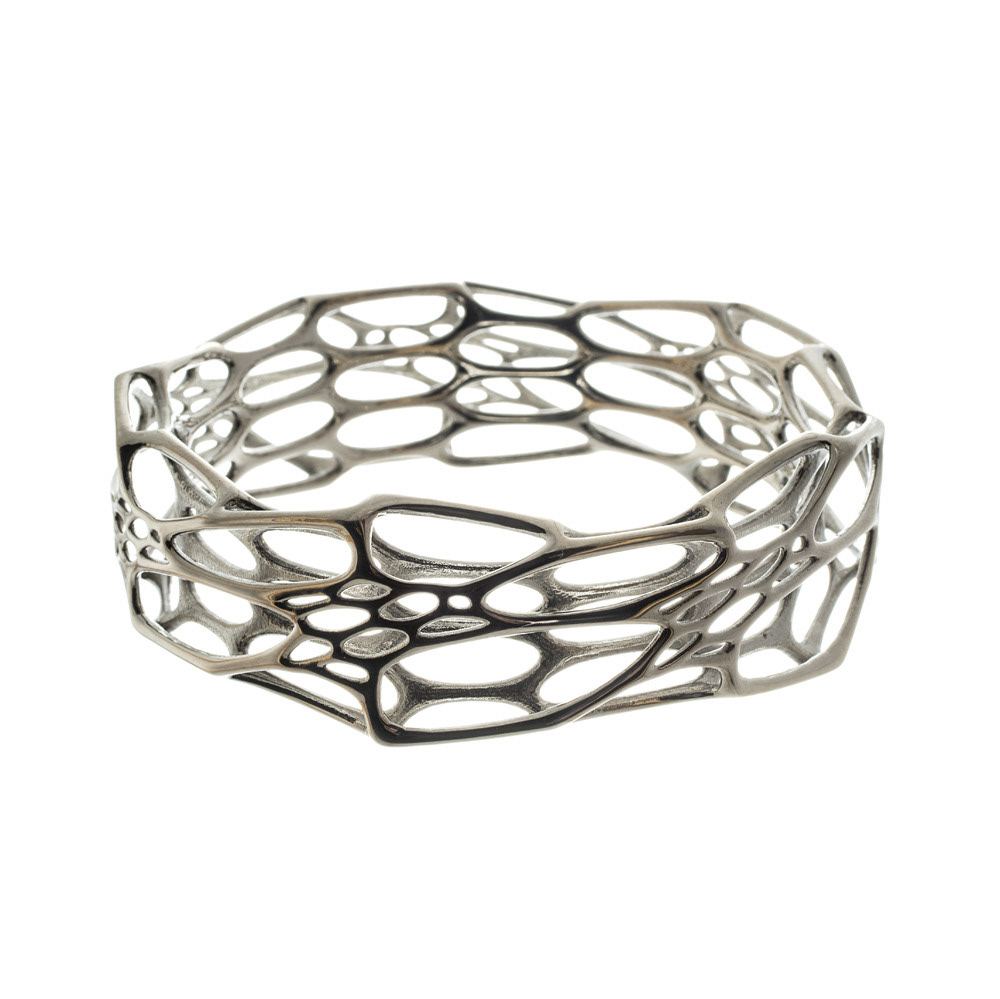
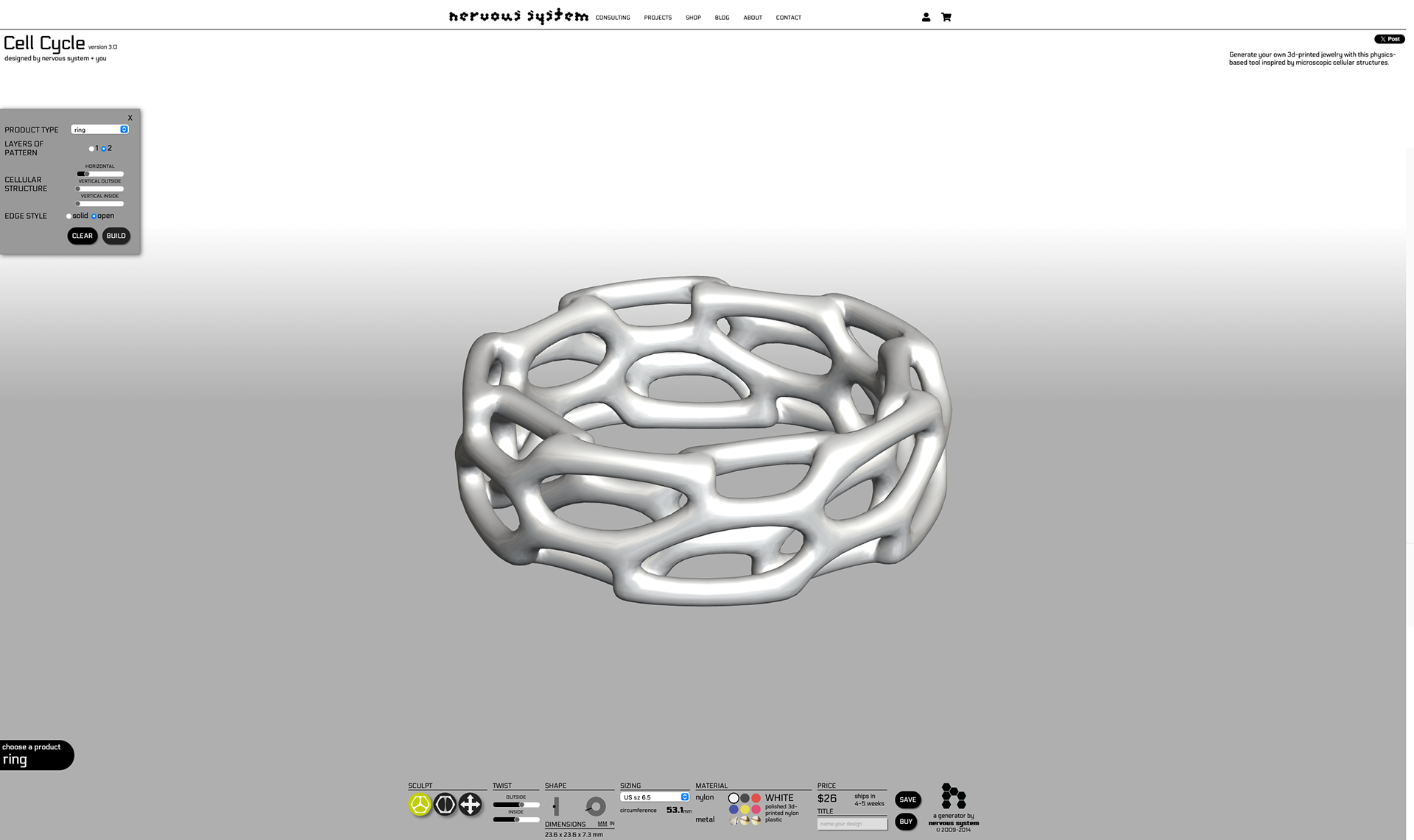
Nervous system
Summary: Uses algorithmic data (inspired by biology) to create generative 3D-printed jewellery.
Nervous System created Cell Cycle Jewellery, a collection of 3D jewellery inspired by radiolarians (a single-celled aquatic animal that has a spherical amoeba-like body with a spiny skeleton of silica). They achieved these forms through simulation of the physics forces in a cellular network. An aspect I particularly like is that they have their own web app which allows you to customise aspects of the simulation, allowing for the customer to have a completely unique product. They use layer by layer 3d-printing with nylon, stainless steel and also offer silver which is cast from a 3d printed wax. Utilising 3D Printing was vital for them as they state "The intricate bi-layer forms would be impossible to create by traditional manufacturing methods". It gives the bonus of being able to give that customer customisation experience without dramatically affecting the overall manufacture process.
Nervous System, offers a range of simulations just like Cell Cycle. They also have a collaboration with New Balance called 'Data-Driven midsoles with New Balance' where they developed "functional 3D-printed midsoles for performance running shoes". "We have created proprietary systems to generate midsole designs from pressure data from runners, making it possible to create variable density cushioning that is customized to how a person runs". Unfortunately I don't believe these are made to the customer's own personal data like Cell Cycle Jewellery but the concept is very interesting.
https://n-e-r-v-o-u-s.com/projects/albums/cell-cycle-jewelry/
https://n-e-r-v-o-u-s.com/projects/albums/new-balance-midsoles/
https://n-e-r-v-o-u-s.com/shop/product.php?code=92
https://n-e-r-v-o-u-s.com/cellCycle/
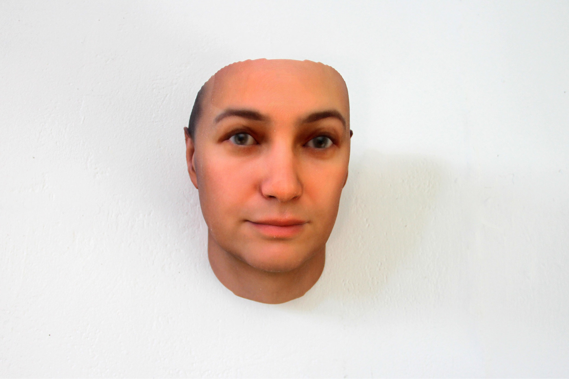
heather dewey-hagborg
Summary: Uses raw biological data (e.g., DNA) to create speculative physical artefacts that explore identity, privacy, and biotechnology.
Heather Dewey-Hagborg’s project, Stranger Visions, involves collecting genetic material from public spaces like "hairs, chewed-up gum, and cigarette butts" using DNA analysis to create 3D-printed portraits of the individuals who left them. This project raised concerns about surveillance, privacy, and the ethical implications of using personal data. Dewey-Hagborg’s process involves extracting genetic markers from DNA samples, using software to predict physical traits, and then translating this data into physical sculptures.
Her work is particularly relevant to my proposal because it demonstrates how raw, abstract data can be transformed into tangible, thought-provoking artefacts. A key strength of her work is its ability to make invisible data, such as DNA, visible and relatable, while also sparking conversations about ethics and privacy. However, to me her work is a little literal and oversimplifies the complexity of genetic data.
The part that is relevant to my proposal is the adoption of using raw data, such as health metrics or environmental data, to create speculative or interpretive artefacts that challenge viewers to critically consider the data’s implications.
https://deweyhagborg.com/projects/stranger-visions
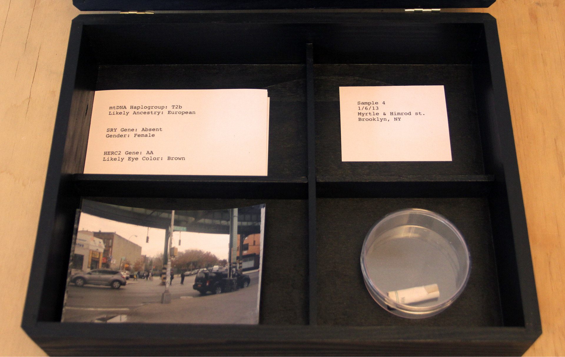
Sample box for NYC sample 4 - https://deweyhagborg.com/projects/stranger-visions
Sample 4 - https://deweyhagborg.com/projects/stranger-visions
Oliver Van Herpt
Summary: Uses real-time data (e.g., sound vibrations) to influence the 3D printing process, creating dynamic, textured forms that embody intangible forces.
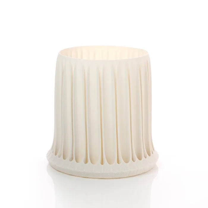
Oliver van Herpt’s work focuses on integrating real-time data into the fabrication process, resulting in unique, data-driven artefacts. For example, in his Textured Vases series, he uses sound vibrations to influence the 3D printing process, creating vases with intricate, organic textures that reflect the audio input. "A specially constructed speaker rig mounted below the build platform produces very low sound. These amplify and create moiré patterns on the ceramic 3D printer". This approach allows him to create physical objects that embody intangible forces, bridging the gap between the digital and physical worlds. His work is particularly relevant to my project because it demonstrates how raw data can be used to create dynamic, evolving forms - relating well to RAW health data.
Van Herpt’s work is the ability to capture the brief nature of data (e.g., sound) in a tangible, permanent form. I particularly like the approach of using real-time data streams to influence the fabrication process, creating dynamic, evolving forms. Depending on how I approach the manufacture method, I could relinquish some of the control I have, which relates back to my Unit X Project's Control aspect.
https://oliviervanherpt.com/solid-vibrations/
https://oliviervanherpt.com/solid-vibrations/
https://oliviervanherpt.com/solid-vibrations/
Mathieu leHanneur
Summary: Explores the intersection of digital technology and traditional craftsmanship, utilising algorithmic processes to generate intricate, site-specific installations that respond to their environment.
Lehanneur's work is characterised by a seamless blend of cutting-edge technology and artisanal techniques, resulting in unique installations that engage with their surroundings. For instance, in his "Liquid Marble" series, he employs computational design algorithms to create fluid, organic forms that mimic natural processes, something that will be very important to my project. "The environment reflects and distorts itself, and the intense black of the marble fascinates by the depth it offers to see", implying that the piece, although static, is constantly changing due to the environment it is held in.
I am particularly drawn to his method of the piece changing depending on its environment. If I were to use heart rate, creating a piece that feels more 'panicked' when in a small room and more 'relaxed' in a larger room is an interesting concept.
https://www.mathieulehanneur.fr/project/liquid-marble-series-v-a-222
Additional:
https://refikanadol.com/works/echoes-of-the-earth-living-archive/
Geoff Tutorial (06/02/2025)
Beta Print Feedback
He likes the idea and thinks it has a good route forward. After showing the beta print, he doesn't think the supports are necessary; however, if they are, then I could look at changing the support angle, which would reduce the amount of filament used and the time required to print.
Other Materials
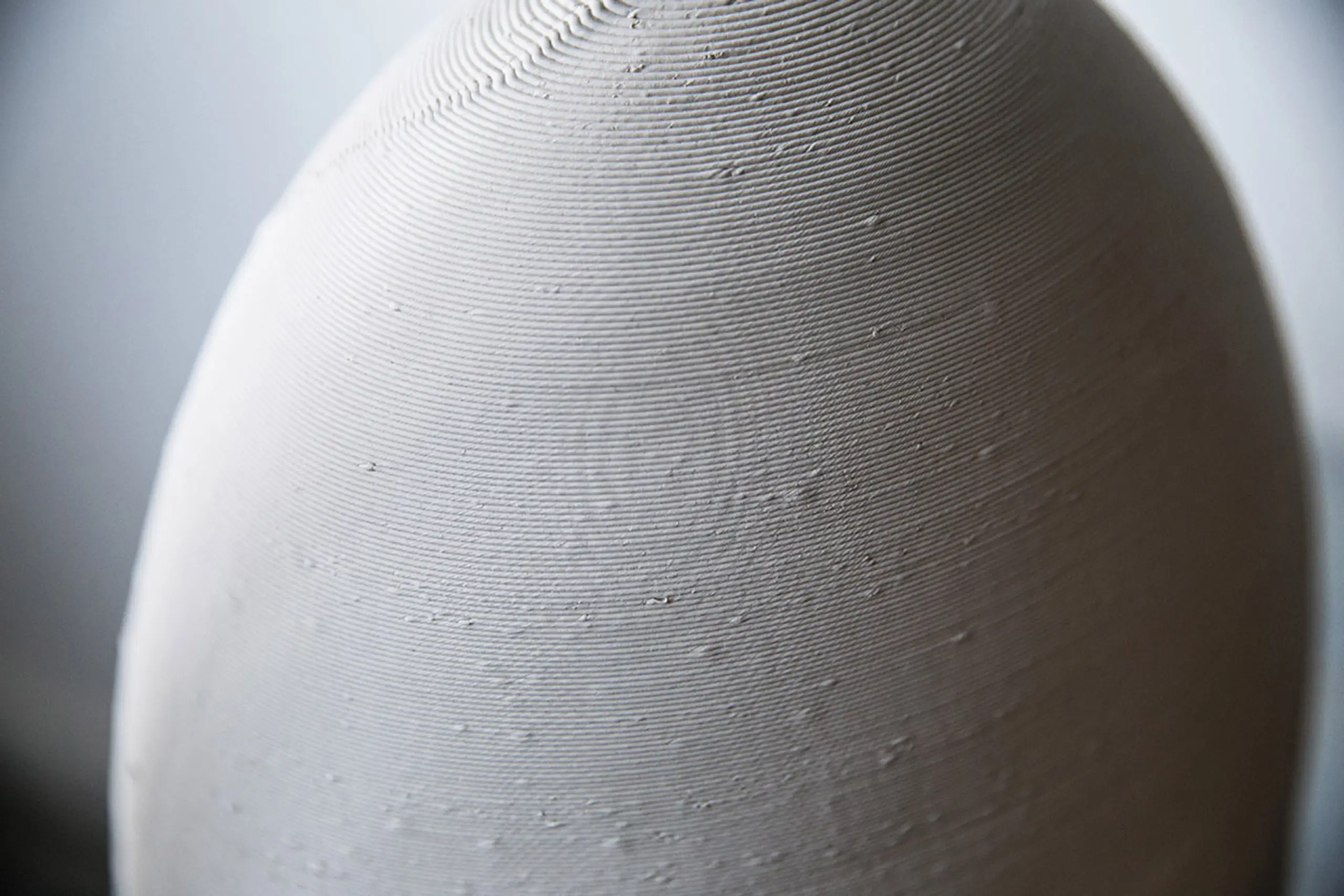
Go back and look at using the ceramic 3D printer, since I’m using the WASP app with porcelain clay.
Enquire about SLS printing in nylon at Print City.
Artist Research Suggestions
Nico Conti - Ceramics - https://www.nicoconti.com
Unfold Studios - https://unfold.be
Further artist research
Nico Conti
Summary: Nico Conti's artistic practice combines traditional ceramic craftsmanship with 3D printing technology, creating porcelain works that explore light, form, and cultural heritage.
Conti pushes the boundaries between traditional craft and modern technology in his ceramic art. His work is based on the use of 3D printing to produce porcelain sculptures, drawing inspiration from classical ceramics, architecture, and nature. For example, in his "Filigree of Light" series, Conti uses 3D printing to craft delicate, lace-like structures in porcelain, which play with light to create an effect.
Nico was brought in the tutorial because my work had a lot of aesthetic similarities. One being the Beta version having 'Tree Support' left inside looking similar to Conti's piece "Gentle Loops" and the delicate "Lace and filigree" initial impression. Although our narratives are completely separate and our materials and different, we still have still got to a similar point.
From looking at Conti's work, I am keen to use porcelain and to explore other materials. For example Nylon in the SLS printer.
https://www.adriansassoon.com/artists/132-nico-conti/
Gentle Loops - https://www.adriansassoon.com/artists/132-nico-conti/
Light Column - https://www.adriansassoon.com/artists/132-nico-conti/
Unfold Studios
Summary: Unfold.be specialises in creating ceramic art through the integration of 3D printing technology, focusing on merging digital precision with traditional craft techniques.
Unfold.be's project "L'Artisan Électronique," is particularly interesting to me. They employ 3D printers to produce ceramics that capture the essence of traditional pottery. This process allows for the creation of unique, organic shapes that you wouldn't typically achieve with conventional methods, offering both the unpredictability of handcrafting and the accuracy of digital design.
They have digitalised the pottery wheel by scanning variations in hand movement and linking that to a piece of software, the user can sculpt an object in real time and then get it 3D Printed. This is taking a form of movement data and transferring it into a physical piece. The idea of the project is to "investigate the intersection between craft, industry, and digital making, avoiding easy categorisation".
https://unfold.be/pages/l-artisan-electronique.html
The hand movement scanner - https://unfold.be/pages/l-artisan-electronique.html
A finished Digitally thrown and 3D Printed object - https://unfold.be/pages/l-artisan-electronique.html
Group Tutorial (13/02/2025)
Feedback
Look at Materialise Magics 3D Print Suite
Could I use other people’s data? GDPR isn't an issue if I keep them anonymous.
Sideways, is there a better way to look at the object as it clearly shows the different stages of sleep?
How consistent can I make the manufacturing, and what scale?
Really good sleep vs really bad sleep - how do they look different?
Add costing in Cura for pricing in the future.
Print using wax to then cast to make silver, gold, etc.
Could I go small size to make into a ring or pendant?
Currently, I’m refining a workflow; later in the semester, I will work on bringing in more data and thinking about how to present it.
Consider Mammoth FDM.
The fragile and ethereal nature of the design inherently links to the sense of sleep (without knowing the context of the piece).
Print in clear PLA - looks like glass.
Artist Research
Hans Cooper - potter, pot-like pieces
Dr Lynne Maclachlan - SLS printing, with dyeing (dynylon) - big pot, heat it up
Further discussion outside of university
Taking a broader concept: represent screen time data. For example, show people just how much TikTok takes up your time; it could really put into perspective how much time we waste.
Package holiday companies - offer a service that, if you wear a smart watch, ring, or fitness device, you give them the RAW data over the time period of the holiday. They take it and form a sculpture, ship it back to you. If you went skiing, it'd be frosted glass. For a beach holiday, it could be something gritty or colourful. It doesn’t need to be sculptural; it could function like a 3D printed whiskey glass.
Further Artist research
Dr Lynne Maclachlan
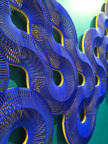
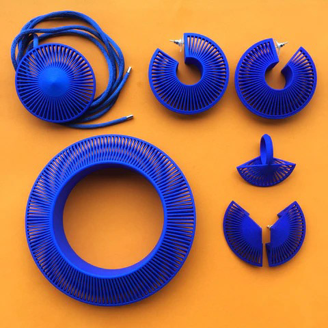
Summary: Dr. Lynne MacLachlan is an artist and designer who uses SLS 3D printing to create vibrant, geometric jewellery and sculptural objects that explore light, pattern, and the fusion of digital precision with craft techniques.
In her Phase jewellery collection and Entangled Tiles (exhibited at London Design Fair, 2017), MacLachlan employs SLS 3D printing with nylon to craft lightweight, intricate forms featuring optical effects like Moiré patterns. She designs using CAD software and custom algorithms, then hand-dyes the pieces with vibrant colours, blending digital automation with analogue finishing. This process allows her to produce complex, scalable designs—like modular tiles—that shift from wearable art to spatial installations, challenging traditional jewellery boundaries.
Her practice merges her aerospace engineering background with craft, using technology to generate mathematically inspired geometries while retaining a human touch through hand-finishing. Taking a similar data-driven aspect I bring to my own work.
MacLachlan’s use of SLS nylon printing and her playful manipulation of light and form inspire me to explore similar materials (e.g., nylon in SLS printers) for my project. Her scalable, environment-responsive tiles also spark ideas for pieces that adapt visually or structurally to their surroundings and perception.
Entangle Wall Tiles - https://lynnemaclachlan.co.uk/blogs/artworks-projects/entangle-wall-tiles
Phase Jewellery - https://lynnemaclachlan.co.uk/blogs/artworks-projects/phase-jewellery-collection
Geoff Tutorial (20/02/2025)
Feedback
Look into scaling and thickness of the object to help rectify the issue with parts not printing.
PETG filament is on the way, so I can use that to print for a more refined-looking object.
Start to get some SLS printing done for testing colour dye.
Contact Whoop and see if they'd like to sponsor my project - Instagram post too.
Look into different mounting options and how I can incorporate that into the model stage so it's printed into the design.
Contact Gary at Print City and get his feedback on SLS and also my Cura settings.
Formative Review 1 (24/02/2025)
Discussed
Since I last spoke with Geoff four days prior, I hadn't made much progress, but we went through my portfolio, and the feedback will be the useful part. He did mention the brand of dye to use— RitDye— as well as saying I should research Michael Eden and the Semi-Conductor art group.
FeedBack
Strengths
Research Integration - ability to relate my research to my own work and understand why they are relevant to my work and how I could use some of their concepts.
Technical knowledge - Use of 3D Printing and the usage of tools like Cura, Fusion, and the usage of different materials like PLA, TPU, and Nylon.
Passion and Progress - Strongest year, praising my enthusiasm and consistent project advancement.
Website Clarity - structure and documentation of my website effectively showcase my work and progress, although hyperlink colours need to be made clear.
Creative Concept - The translation of sleep data into physical forms is a great idea, and the execution to get the visual forms I did was praised.
Areas for improvement
Data-to-Design Link - I need to clearly explain the reason why... what is the importance of all of this? Why sleep data?
Data Presentation - The large sleep table needs to be scaled down or only show a few lines; also, add dates in or key highlights.
Object Purposes - Purpose and presentation need to be considered... what will they be?
Gary at Print City (27/02/2025)
Recommendations
I went to Print City to collect my nylon prints, and whilst I was there, I took the time to enquire about the other machines and which ones he recommends I use for what I’m trying to achieve.
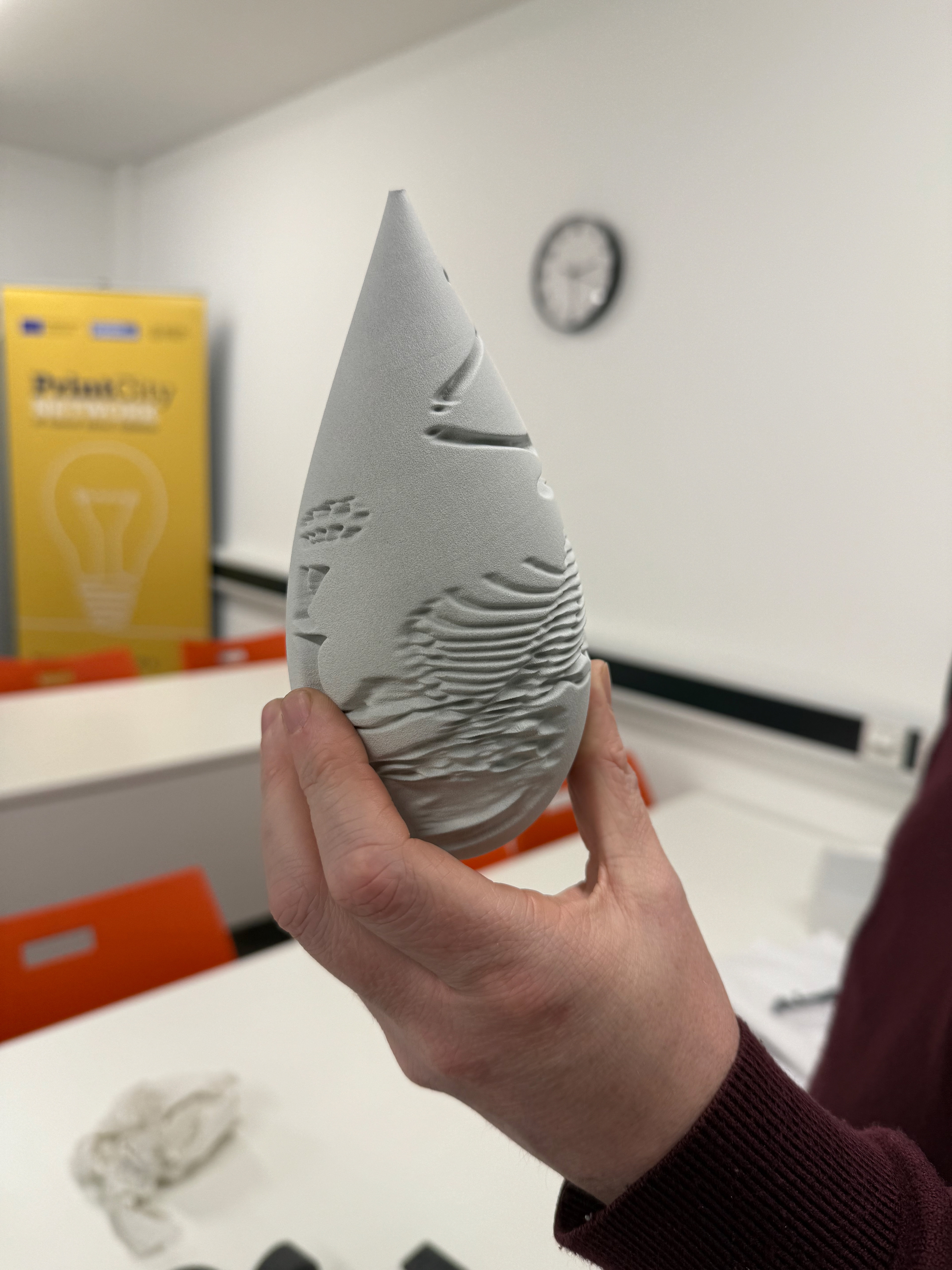
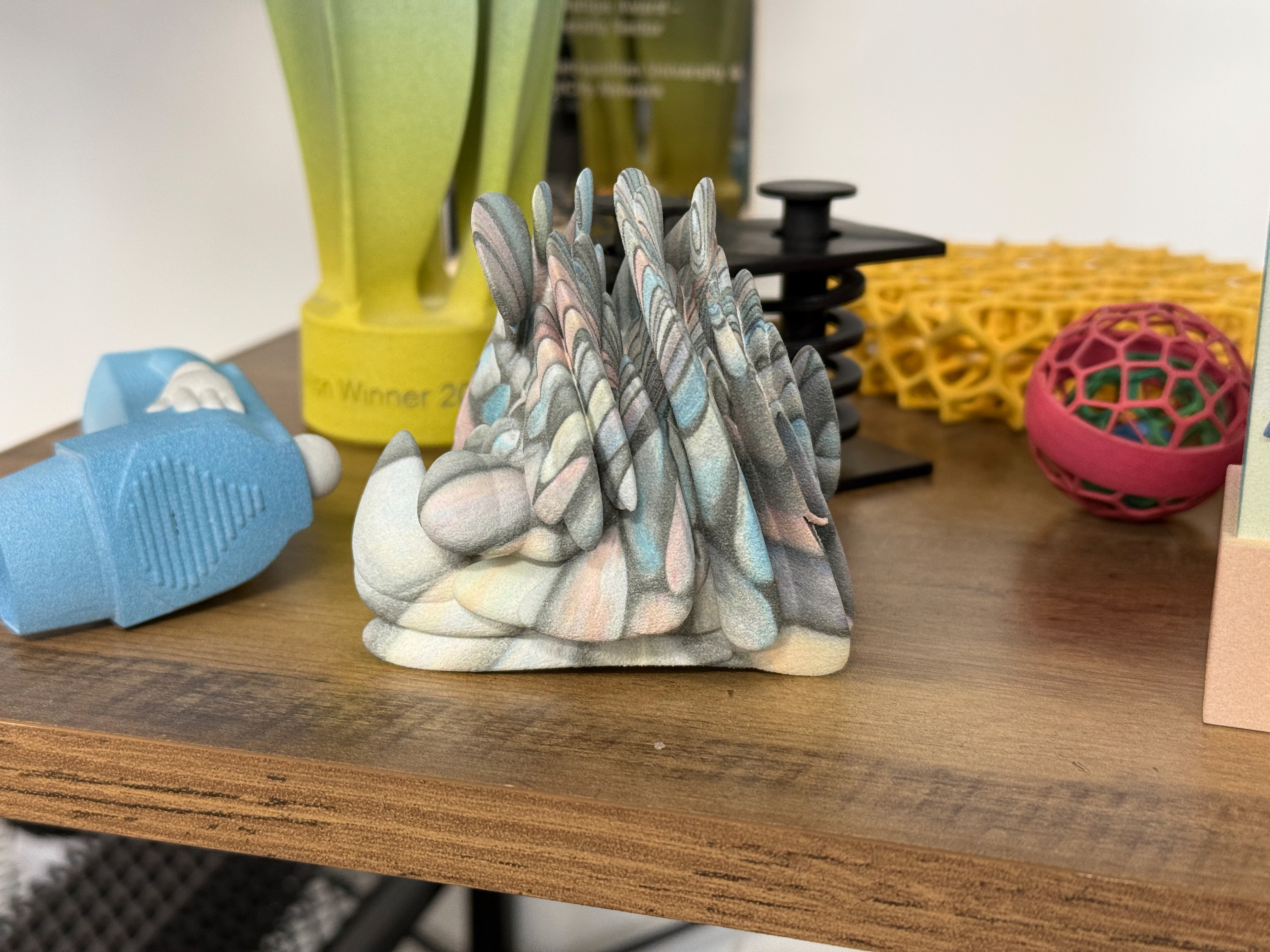
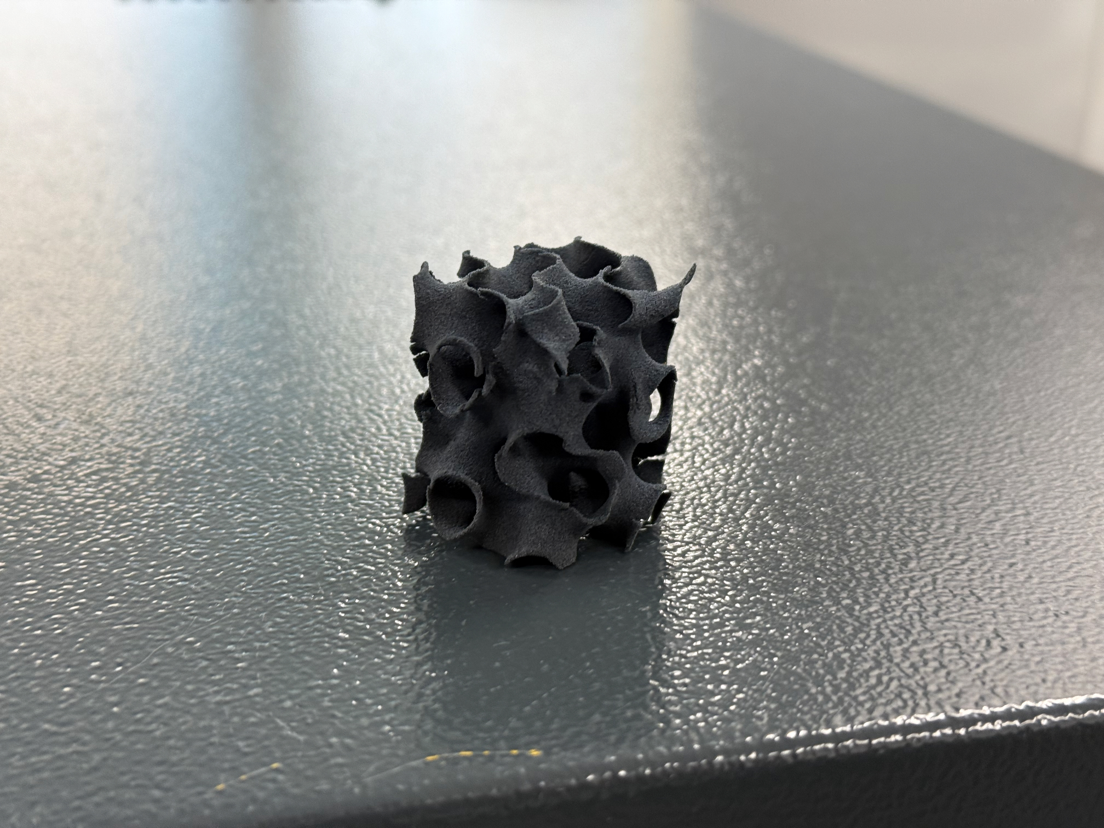
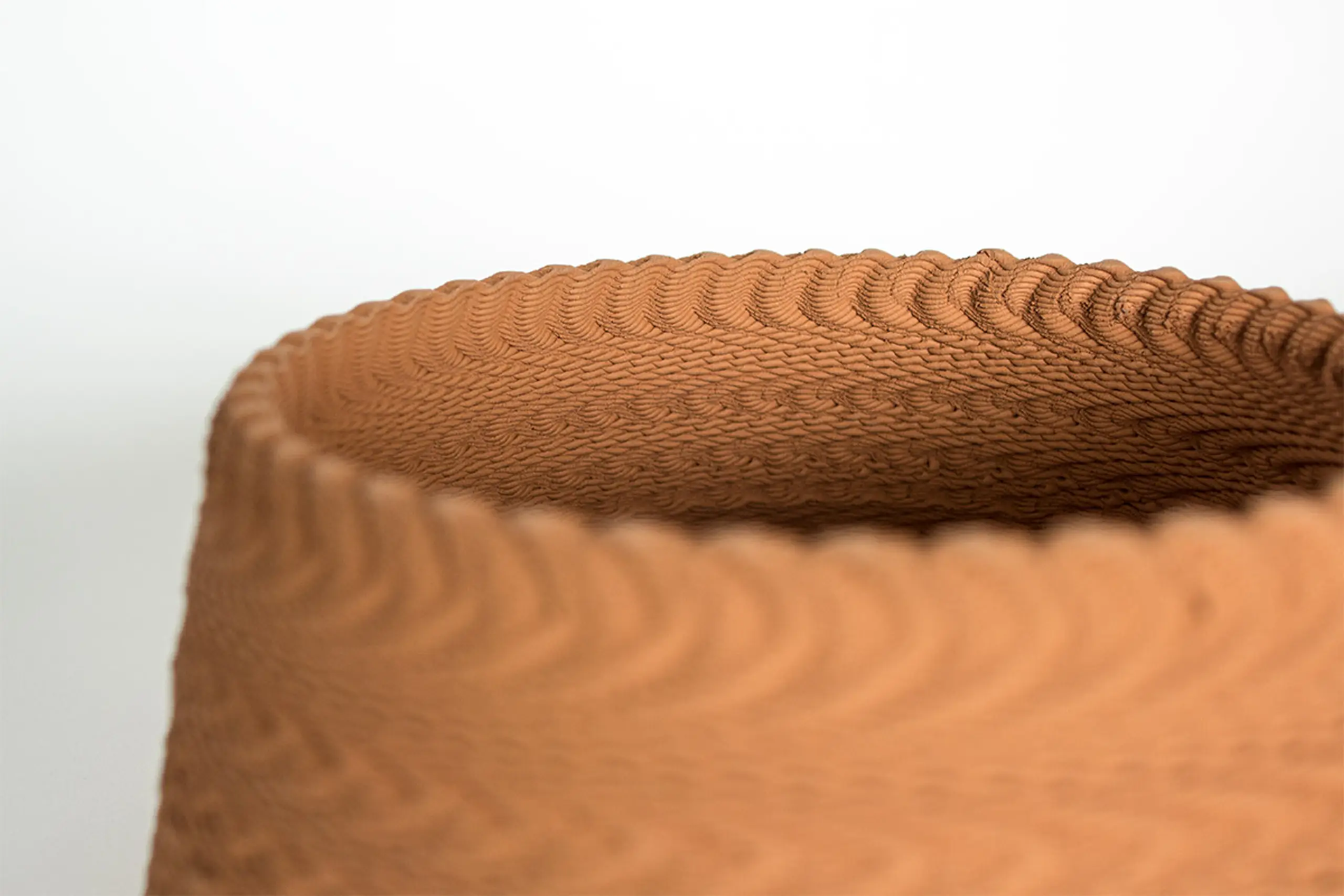
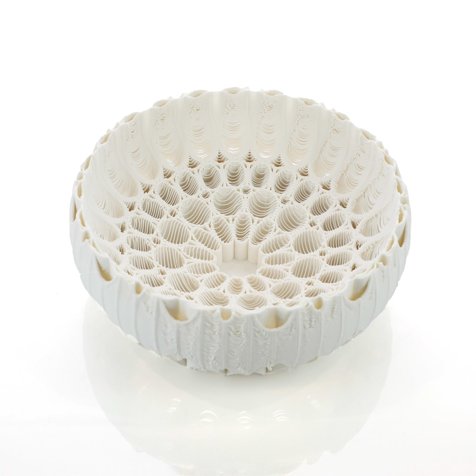
The first two pieces were printed on the HP Jet Fusion 580, which is a full-colour 3D printer and used Nylon PA 12 powder, a similar material to the FormLabs Fuse1 SLS printed that I used for my two nylon prints.
The first image shows what colour it prints in by default, a much lighter grey, allowing for much better dyeing possibilities. The second image shows what happens when you add colour during the print process; it's not very vibrant but still adds colour. I have requested two prints to be made on this printer, one being Version 8 (the ones I had done using the SLS printer) and Version 10 (a much larger and more intricate object). This will allow me to understand this printer’s capabilities and how well this colour and specific type of nylon powder dyes.
The final image shows a small object that was SLS printed also on a FormLabs Fuse1 but uses TPU 90A Powder, similar to the TPU 95A I used in the studio's Ultimaker S5. Since it is a plastic, it's much stronger and allows for much more complicated designs to be printed.
Jonathan Boyd
Group Tutorial
Why does it need to be accurate? I think it needs to be accurate to the data, but saying that, within the data, the two large sections that protrude (the fins) are anomalies where the data wasn't complete, and as a result, the average is very high, so technically these "fins" don't need to be accurate.
These objects are vessels of sleep - we understand a vessel as like a cup. This cup would hold the narrative of sleep - dream-like. Relating to "Carrier Bag Theory of Fiction" by Ursula K. Le Guin.
Look at the inside, not just the outside; the inside is just as interesting and don't forget about it. Perhaps actually focus on that because it's the internal aspect. For example, the outside is how we appear to others after sleep vs the inside, which is how I feel after the sleep. Reality vs perception.
Degree Show Curatorial
Collect Review
Since I unfortunately couldn't attend Collect, I took notes during the presentation of the good and bad aspects of curation, all based on images students uploaded.
Good
360 walk-around
Complimentary colours
Bright colours, vibrancy, needs to pop (especially for new designers because we’re with textiles who normally are vibrant)
Writing with the piece is generally preferred rather than having to enquire
“If I buy this, how do I install this at home?”
A-Z or 1-x key that hides all the details for each piece but makes it easy to find
Picture of person on the label to identify artist
Signage? No touch
Gallery glass for minimal reflection
Even if an aspect of your work isn’t yours (like flowers in vases) don’t be cheap
Plinths can be coloured too, make sure it’s complimentary
Use lighting and shadows
Needs to feel approachable
The stands or “what it sits on” can be used to reinforce an object’s story
Object then name on labels
Use of “props” or other things to enhance your objects
Stagger of plinths when objects’ heights are different
Lighting for photographs not just in person (subtler lighting)
Calming and peaceful curation is better
Bad
Plinths need to look perfect, can’t be chipped or tainted.
Labelling needs to be easy to view.
Clear labelling needs to be clear so objects are easily identifiable.
Titles of work are imprinted.
Room and plinths can’t be cluttered.
If objects are near, they need to be complimentary.
Don’t use acrylic blocks.
Ensure your workspace is separate from your pieces (hide boxes, laptops, etc.).
Height of objects needs to be considered.
Consider shadows from windows and internal lighting.
Groupings - less is more.
Don’t overcrowd if you use external features (like flowers) and bring in a professional.
Form board.
Overview and key takeaways
Labels and quality of them
We need to mock up well in advance for New Designers so plinths can be ordered.
What do WE want for Degree Show?
Reduction of plinth and use of flat tables
Business cards and booklets/catalogues
Extras:
At New Designers, we need to know everyone’s work because we may be asked questions. It’s very important we learn what everyone’s work is about.
Title for Degree Show (Community decision)
Lillie Tew additional information
How the work engages with its space is vital.
Since we all have very different work, playing with elements of the space will be important.
Wall mounting or more table-based, what do we prefer? 50:50 so likely it will be a mix of both but more 80:20 table:wall.
Don’t be chunky and bulky either, plinths.
Is colour on a plinth or workspace required and if so how do we make it look good?
How we want to view our work and how do we want someone to walk around our work?
Collect is SELL but Degree Show/New Designers(ish) is a showcase.
How do we break up a space to tell the story?
Lighting is so important, it can ruin or make an object.
Multiples are possible but restraint is necessary.
Minimal labels are best.
Paper, embossing and colour are so important for business cards, just buy loads because they will just be waste.
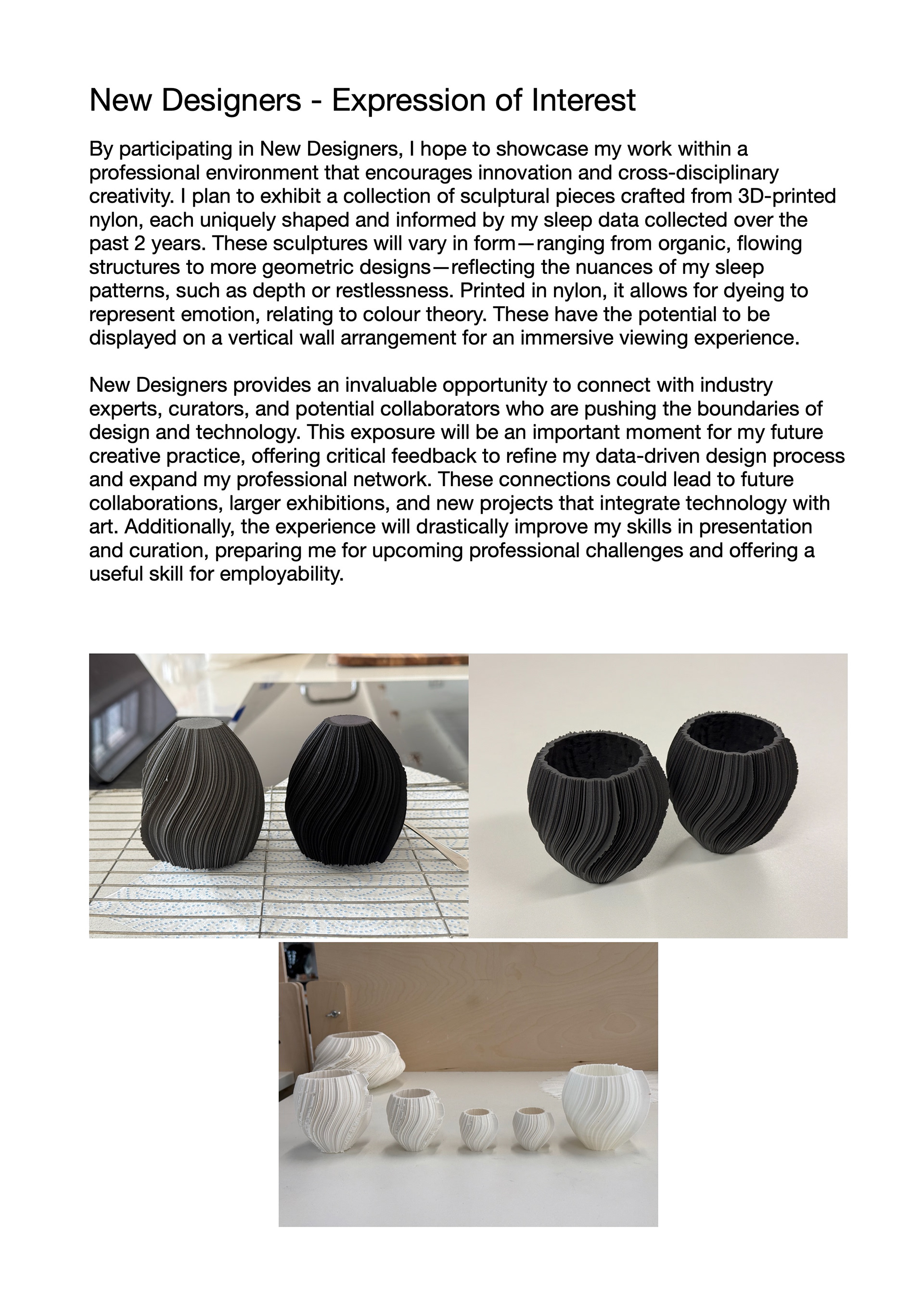
New Designers Expression of Interest
I regrettably rushed the submission, and as a result, it isn't my proudest submission, but it answers the two key questions:
•What do you want to exhibit at New Designers (plus images)?
•How can New Designers support your future creative practice ambitions?
Darklight Design
Fellow student, Kate Quinsee, sent me a post on Instagram by Dezeen that showcased a lighting solution and a mounting system that would work really well with my own work, which has led me to conduct the following research. The post highlighted the Aureole collection by Rollo Studios.
Wall Light
The 'Aurelo Collection' are a range of different 3D-printed Quartz Sand lamps, this is made possible through Blinder Jet Additive Manufacturing. "Drawing inspiration from nature, these lamps are not just for creating an ambiance; they are limited-edition artworks that transform any space with their organic structures and captivating interplay of light and shadow." - this is similar to what I want my pieces to be, not just functional or sculptural but more of a 'useful beauty'.
An important aspect of this collection is the inside. Since they are all wall-mounted, the inside is where people are naturally drawn. This is also enhanced by the spiral design. This reinforces Jonathon Boyd's thoughts on my work of looking at the inside and not focusing all my effort on the outside. The outside is still very important because the angle of viewing won't always be front-on, so I will still have to consider the outside, but I don't need to put all my focus into it.
https://www.rollostudio.com/o-aureole/sun-vxs1
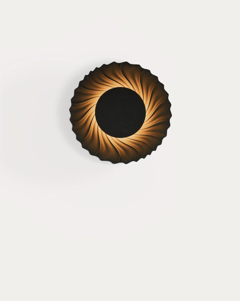
https://adorno.design/pieces/sun-vxs-01-3d-printed-sand-wall-lamp/
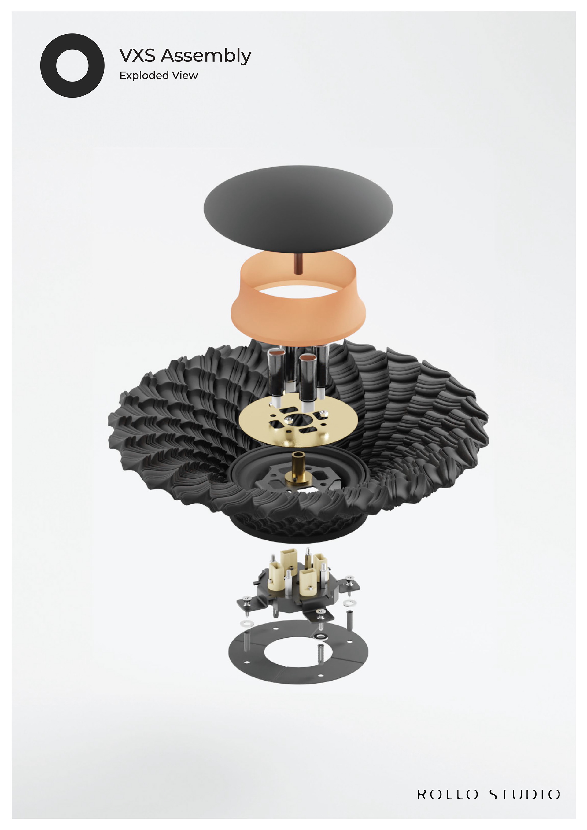
Mounting
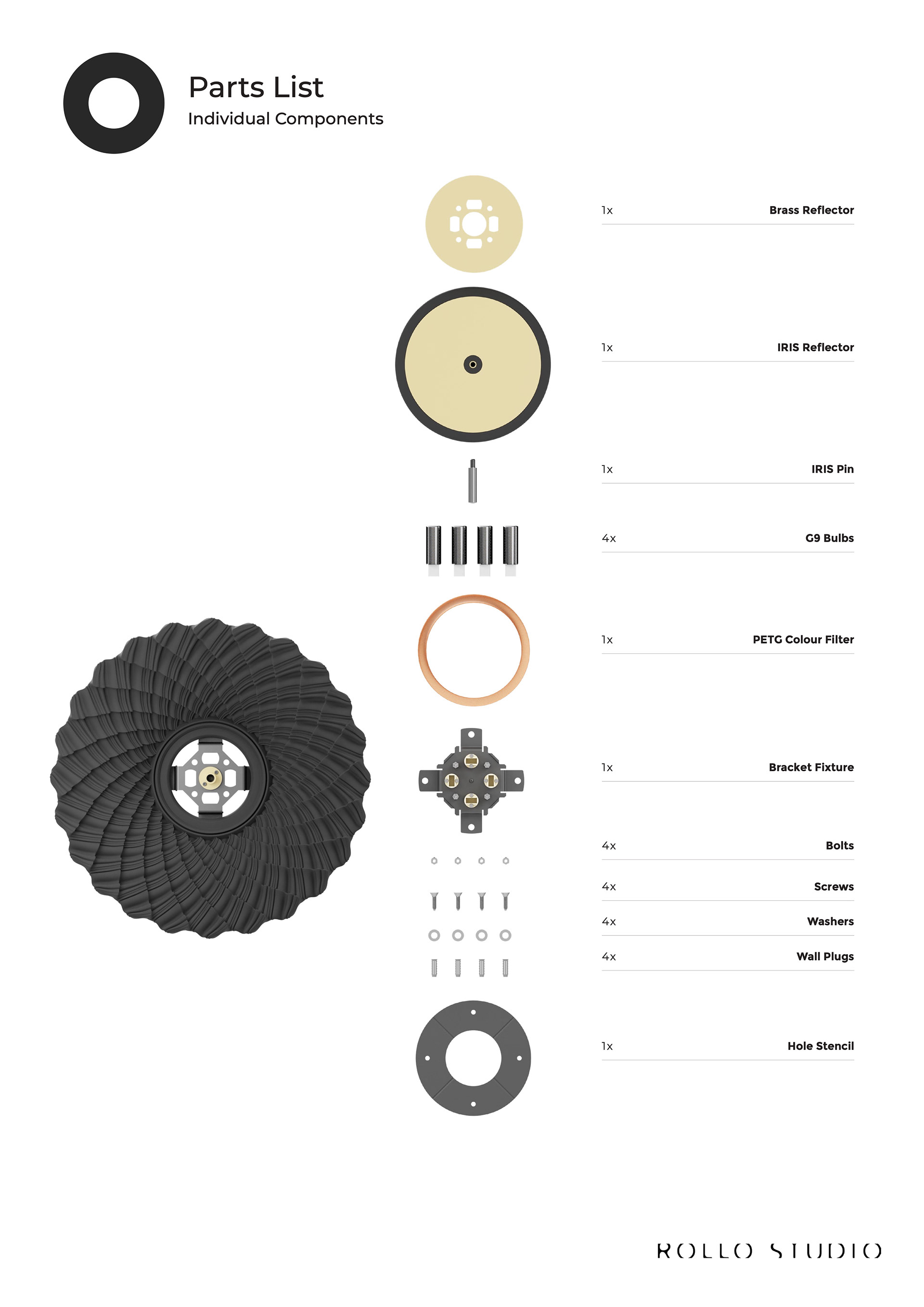
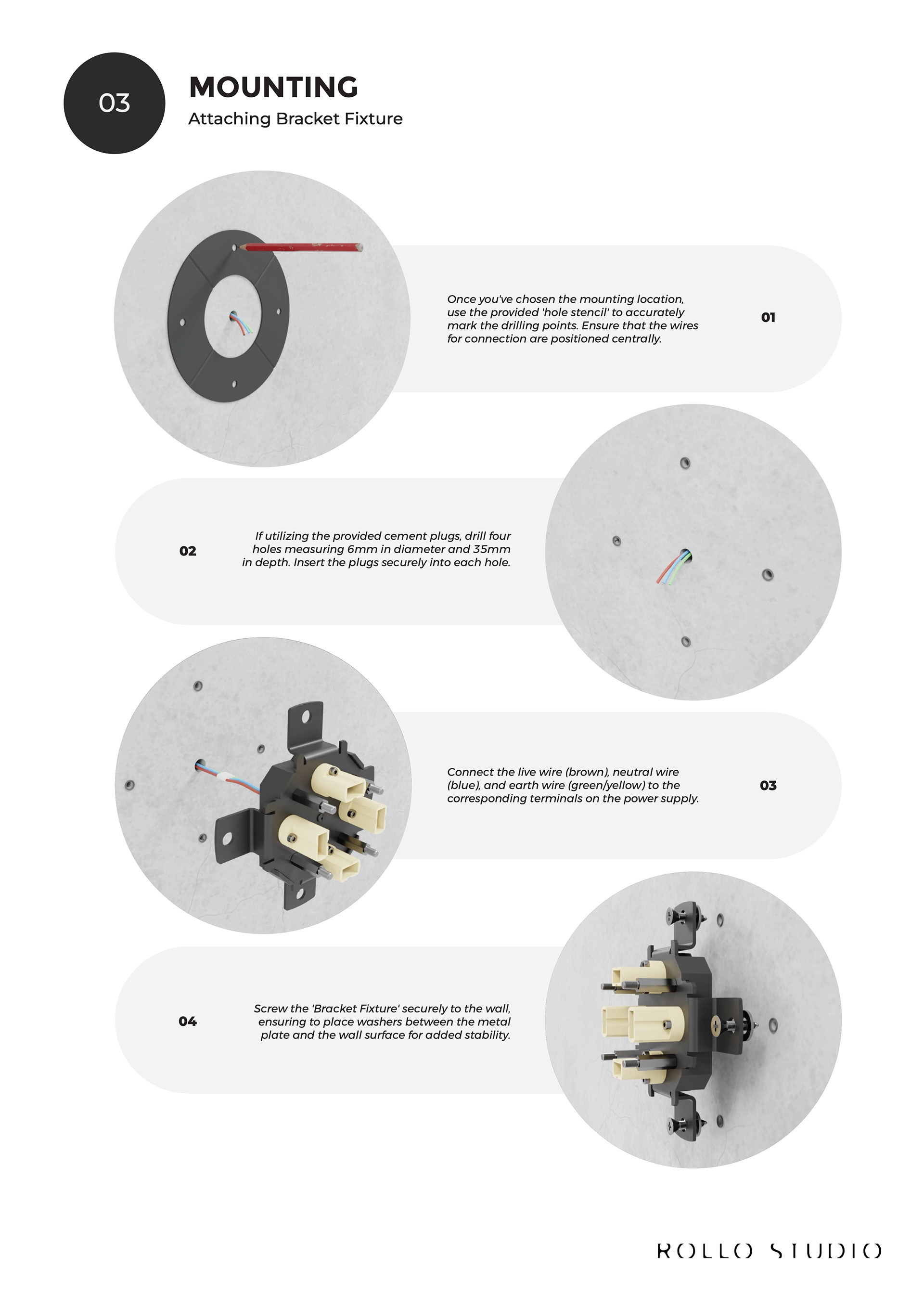
The mounting system for the Aurelo Collection is really quite simple and intuitive. Everything just slots together, keeping the object, the lighting system, and the mounting all separate from each other. The object has built-in gaps and slots for the bulbs, screws, and iris pin to fit.
The IRIS reflector not only helps reflect the light back into the object but also hides the mounting system seamlessly. Because of the PETG Colour Filter and the height and angle of the object's walls, no matter what angle you look, you won't see the mounting system.
To fix the object to the wall, it takes just four screws, and the bracket is mounted to the wall prior to the object being attached to make it as easy as possible. Once the object is placed onto the bracket and secured, the bulb, iris pin, and colour filter all slot in. You build it up slowly and logically.
Group tutorial (13/03/2025)
Context Video
Feedback
Quite simple - just a video of me sleeping, possibly including strenuous activities that I did during the day to give further context.
Overlay of information - "at this point the sleep pattern I was in was…"
Quality of light/brightness and sleep - winter would be very different to summer, i.e. sleep.
Wear gloves for final objects because grease, etc., will occur.
O-ring mechanism to lock it in place? Or use a simple twist-locking mechanism.
Sand the top of the nylon piece to see what's there - just for curiosity.
If I use colour, could the dye correlate to how we felt after the sleep?
If the light is part of it, show how it works - ambiance, brightness, etc. - this will be sleep so a night light… what does a night light need to be to work well?
What is my research question? - Back to DC3 proposal.
HP Jet Fusion 580 Printer
What happened?
Following my visit to PrintCity on 27/02/2025, I wanted to print some versions using this technology, especially because it would print in white nylon, allowing me to explore colour in depth and take this project a different route. Unfortunately, over the course of a few weeks, the bed didn't fill up, and once I sent more files to be printed, the machine failed to start, meaning I was unable to pursue this avenue of exploration. This is disappointing as I was keen to explore a concept involving colour; however, this was out of my control, and these things happen.
Geoff Tutorial (20/03/2025)
Feedback
After showing Geoff the Version 5 mounting system, his feedback is to make it smaller and add a lock at the bottom to stop it from free-spinning.
For lighting and using an Arduino, he sent me a wiring diagram generated by ChatGPT to demonstrate how I could wire up an LED.
Pricing - Look at Materialise and see that Polyamide is nylon.
I'm currently under someone else's timetable, so I need to start doing other tasks whilst the final piece is being made, like the mounting system and lighting feature.
Formative Review 2 (24/032025)
Key Parts from the Transcript
Challenges in resolving the piece, particularly the dependency on Print City's time.
The bulk of the feedback was involving the internal vs external design. The plastic pieces have an interesting internal geometry as well as external, whereas the nylon piece I brought doesn't have such an interesting inside, leading the tutors to ask whether I should proceed down the path of internal lighting rather than external lighting and really making my object pop. Gold leaf on the top was mentioned as well as looking further into dye.
They also mentioned that this was quite a late stage to look at lighting for the internal and maybe I should look at off-the-shelf systems rather than creating one myself.
Time constraints and reliance on Print City's timeline are critical issues. They urged me to decide between refining the objects as standalone pieces or to trick the lighting integration. The experimentation phase is over and a clear decision is needed to resolve the project’s direction and context.
My thoughts
I very much agree with everything that was mentioned. However, the internal geometry of the nylon pieces will be interesting; I just need to wait to receive the prints to confirm. The project is about taking data and making it interesting by giving it a new form; as a result, either path would work. Refining the object further for me is fine, but aside from looking at more dyes and cleaning up the fins, I don’t know how else to do that. By going down the route of internal lighting, it highlights the inside detail (if it exists), which is something Jonathan Boyd pointed out, but it also gives the piece a function. Since this project is about viewing data, it is very important I don’t take away from the outside of the objects, so the internal lighting needs to be complimentary rather than the focus point. This will come from brightness variation as well as refinement to the mounting system. So, consider the time left and my confidence in pulling off an elegant lighting system; I will continue down that path providing the nylon prints have an interesting and relatable internal surface.
pricing notes (31/03/2025)
Notes from pricing lecture
Always have a price.
Password protect pricing extra to not disclose to professionals how I price, so they don’t take advantage of it.
Start high.
Room to negotiate - galleries will take 25-50 or even 60% of your work.
Compare price to competitors and make sure the gallery I choose sells similar priced items because of the client scope.
Always have an exhibition copy of your work.
Sell or return - give to gallery for free until it’s sold or returns, works with batch of lower value. However, if they don’t sell it, it doesn’t look good for you.
Price model on 2nd edition because it’s a refined workflow
Dont reflect R&D.
Agent commission - ask them “what have you sold in the last 2 years” and if it’s good, take the conversation further.
Contingency - 20%/30%.
Exclusivity - don’t do it because they will mess you around.
Public liability insurance - for exhibition or public places.
CV - know your audience, client, gallery, commission, exhibition, etc. What skills have I acquired outside of your practice - especially transitional skills.
Hourly rate for me - £27.08 per hour.
Daily rate (hire me) - £216.63 per day.
DACS - resale royalties similar to NFTS.
Geoff tutorial (31/03/2025)
Feedback
I could look at SLA printing the mounting system, which would give it a more refined material, and I could make it look like a lens with crystal-clear resin, polish it, and then it would diffuse the light even better.
The fins, I need to look at how to fix them if, on the final pieces, they mess up. I'm thinking of sanding them down gently. I will test this with my scaled-down nylon versions.
Geoff tutorial (07/04/2025)
Portfolio analysis
Change layout to be easier to read (stop the reader from jumping around the page).
Clarify the concepts are written only.
Make single pictures smaller.
Let's see it all working.
Timetable
Complete Timetable
Copy of my timetable I used to keep track of my commitments.